Kirby's Wrath Revealed: Ex-Nintendo Insiders Speak Out
Author: Lucas
Feb 22,2025

Unlocking the Mystery of "Angry Kirby": A Look at Nintendo's Localization Strategies

Why does Kirby look different in the US compared to Japan? Former Nintendo employees shed light on the evolution of Kirby's image in Western markets, revealing a fascinating story of localization and marketing strategies.
The "Angry Kirby" Phenomenon: A Western Appeal
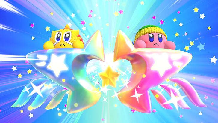
The "Angry Kirby" moniker, coined by fans, reflects a deliberate shift in Kirby's presentation in the West. Leslie Swan, former Nintendo Localization Director, clarified in a 2025 Polygon interview that the goal wasn't to portray anger, but rather determination. While cute characters resonate broadly in Japan, the US market, particularly among tween and teen boys, favored a tougher image. Shinya Kumazaki, director of Kirby: Triple Deluxe, echoed this sentiment, noting that while cute Kirby is a major draw in Japan, a more battle-hardened Kirby appealed more to US audiences. However, this wasn't a universal rule; Kirby Super Star Ultra featured a tougher Kirby on both US and Japanese box art. The aim was to highlight Kirby's serious gameplay side while acknowledging the enduring appeal of his cuteness in Japan.
Marketing Kirby as "Super Tuff Pink Puff"

Nintendo's marketing actively sought to broaden Kirby's appeal, especially to boys. The "Super Tuff Pink Puff" tagline for Kirby Super Star Ultra (2008) exemplifies this strategy. Krysta Yang, former Nintendo of America Public Relations Manager, explained that Nintendo aimed to shed its "kiddie" image, recognizing the perceived negative impact of such a label. This led to a conscious effort to emphasize Kirby's combat abilities and portray him as a more robust character. While recent years have focused less on Kirby's personality and more on gameplay and abilities (as seen in Kirby and the Forgotten Land's marketing), Yang acknowledges that the "cute" perception remains prevalent.
Regional Variations in Localization
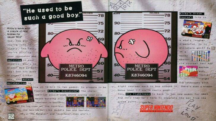
The divergence in Kirby's localization began early. A 1995 "Play It Loud" ad featuring a mugshot-style Kirby is a prime example. Subsequently, box art frequently showcased Kirby with sharper eyebrows and more intense expressions (e.g., Kirby: Nightmare in Dream Land, Kirby Air Ride, Kirby: Squeak Squad). Beyond facial expressions, even Kirby's color palette was adjusted. The original Kirby's Dreamland (Game Boy, 1992) featured a desaturated Kirby in the US, due to the Game Boy's monochrome screen. This, combined with the perception that a "puffy pink character" wouldn't sell well to a broader audience, contributed to the shift in visual representation.
A Shift Towards Global Consistency
Both Swan and Yang agree that Nintendo's approach has become increasingly globalized. Closer collaboration between Nintendo of America and the Japan office has resulted in more consistent marketing and localization. The company is actively moving away from regional variations like the distinct Kirby box art and avoiding past marketing missteps. While this global strategy ensures brand consistency, Yang notes potential drawbacks, such as a loss of regional nuance and potentially bland marketing. However, the increasing familiarity of Western audiences with Japanese culture may also be a factor in this shift towards a more unified approach.


![NULL [Remastered]](https://imgs.39man.com/uploads/71/1719651062667fcaf6c483b.png)